
One of the most enjoyable things about using clipart is being able to combine different pieces and create something that did not exist before. A rabbit, a few flowers, some leaves, and a little mushroom can suddenly become an entire scene. The tricky part is knowing when to stop. It is very easy to keep adding things simply because you have so many beautiful pieces to choose from.
A good design does not need to use everything in the folder. In fact, most of the time, a few carefully chosen pieces will look better than a page filled with artwork. The goal is to make the different elements feel like they belong together while still giving your design enough breathing room.
Start With One Main Subject
The easiest way to keep a design from becoming overwhelming is to choose one main subject first. This is the piece you want people to notice before anything else. It might be an animal, a cottage, a floral arrangement, a pumpkin, or even something as simple as a teacup.
Once you have chosen that main piece, everything else should support it rather than compete with it. If your main image is a rabbit, for example, you might add a few flowers around its feet and one branch nearby. You probably do not also need three mushrooms, two birds, a basket, a stack of books, and a lantern unless you are deliberately building a larger scene. Starting with one focal point makes every other decision easier.
Add Supporting Pieces Slowly
Instead of placing ten pieces onto the page at once, add them one at a time. Put your main image in place, then add one supporting element and look at the design before adding another. A flower cluster might be enough. If it still feels a little empty, add a few leaves. If the composition needs balance on the other side, try one smaller element there. Working slowly makes it much easier to notice when the design already feels finished. If you add everything at once, it can be harder to tell which pieces are actually helping.
Pay Attention to Size
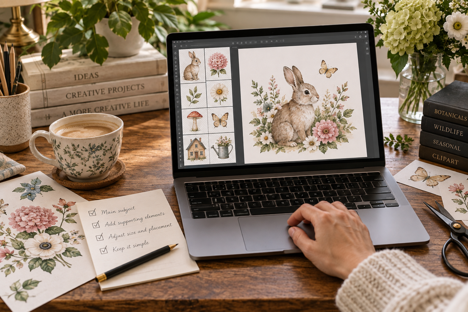
Not every piece of clipart should be the same size. In nature, objects are different sizes, and the same idea helps a digital composition feel more natural. Your main subject should usually be one of the largest elements. Supporting pieces can then become progressively smaller. A large rabbit might be surrounded by medium-sized flowers and a few tiny leaves or berries. If everything is equally large, the eye does not know where to look first. Changing the scale creates a clear visual order and helps the main subject stand out. This is one of the simplest ways to make a design look more polished.
Let Some Pieces Overlap
Clipart does not always need to sit neatly beside other clipart. A small amount of overlapping can make separate pieces feel like they were meant to be together. You might place a few leaves partly behind a flower, tuck the bottom of an animal slightly into a floral arrangement, or allow one branch to extend behind another element. These small overlaps can turn several individual PNG files into something that feels like one finished composition. The key is not to overlap so much that important details disappear. You still want each piece to be recognizable.
Use Similar Colors
It is much easier to combine artwork when the colors already work well together. This is one reason using pieces from the same clipart collection can be helpful, because they were designed with a shared palette in mind. If you are mixing artwork from different collections, look for colors they have in common. A dusty blue flower might work beautifully with artwork that includes muted blue, sage green, warm ivory, or soft pink. If one piece is extremely bright and everything else is soft and muted, it may pull too much attention away from the rest of the design. That does not mean you can never mix different palettes, but it helps to have at least a few colors connecting the pieces.
Leave Some Empty Space
Empty space is not wasted space. It gives the eye somewhere to rest and helps the artwork you do use feel more important. This can be especially difficult when you are working with clipart because an empty corner can make you think, “I could put something there.” You certainly can, but that does not always mean you should. If a design feels cluttered, removing one or two elements is often more helpful than moving everything around. Try taking something away and looking at the design again. You may be surprised by how much calmer it feels.
Build Around an Invisible Shape
One little trick that can make arranging clipart easier is imagining a simple shape underneath the composition. You might arrange flowers around a loose circle, build a horizontal design that follows a gentle curve, or place elements in a rough triangle with the main subject near the center. You do not need to draw the shape or make the arrangement perfectly symmetrical. It is simply a way to give the composition some direction. This is especially useful when creating floral arrangements, wreath-like designs, borders, and small scenes.
Repeat Small Elements
Repeating one or two small details can help a design feel connected. If there are little white daisies beside your main subject, you might repeat one or two of those daisies somewhere else in the composition. The same thing works with leaves, berries, stars, snowflakes, or other small decorative pieces. You do not need to repeat everything. Just one familiar detail appearing in a second place can make the entire design feel more intentional.
Keep the Background in Mind
The background is part of the design too, even if it is just a simple color. Watercolor artwork often looks beautiful on warm ivory, soft cream, pale sage, dusty blue, or other gentle backgrounds. A quieter background lets detailed artwork remain the focus. If you are using a patterned background, photograph, or decorative paper, you may need fewer pieces of clipart because there is already a lot happening visually. Sometimes changing the background is all a crowded design needs. A simpler background can make the exact same arrangement feel much calmer.
Step Away for a Minute
When you have been staring at a project for a while, it becomes surprisingly difficult to tell whether something looks balanced. If you are unsure, save the design and walk away for a few minutes. When you come back, look at it before making any changes. You will often notice immediately whether one area feels too crowded or something is pulling too much attention.
Another helpful trick is to make the design very small on your screen. When you look at the whole composition instead of individual details, it becomes easier to see whether the overall balance is working.
Try Removing One Thing
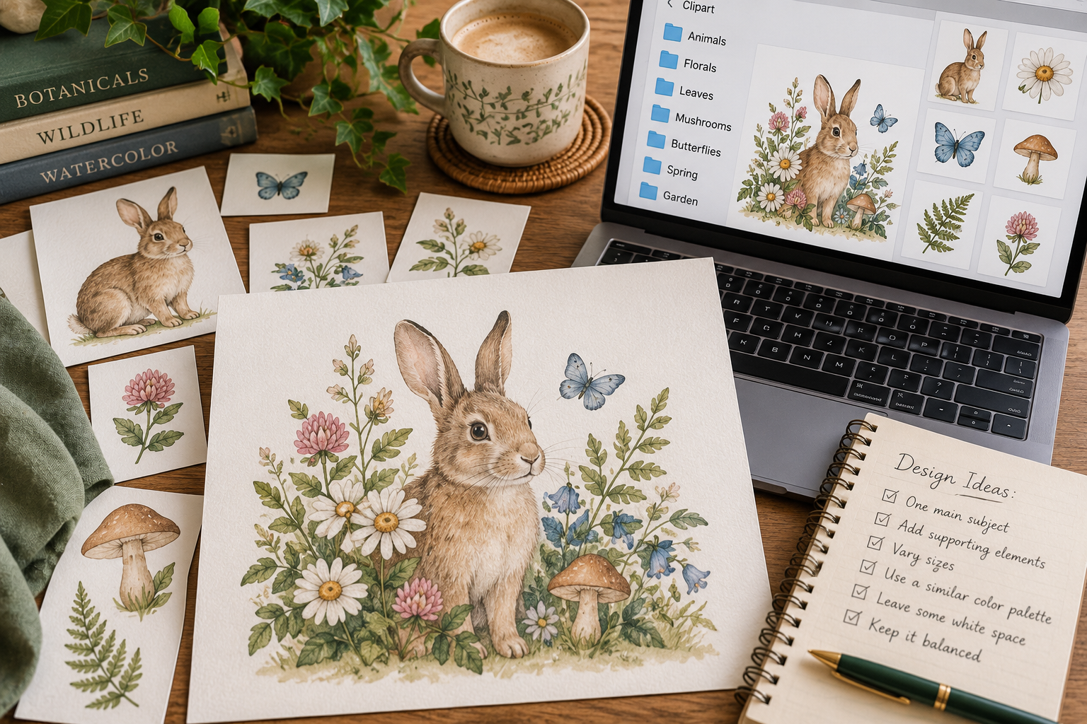
When I am deciding whether a design is finished, one of the easiest tests is to remove something. Take away the last flower you added, the extra branch, or the little object tucked into the corner. If you immediately miss it, put it back. If the design suddenly feels cleaner, you probably did not need it. This works surprisingly well because it is often easier to see what is unnecessary than to decide whether something new should be added. There is nothing wrong with a detailed composition, but every detail should have a reason to be there.
Make the Design Feel Like Yours
There are plenty of design rules, but they are really just tools. They are there to help when you feel stuck, not to make every project look the same. If you love full, layered arrangements, make them. If you prefer one tiny rabbit sitting in the middle of a mostly empty page, that works too. The wonderful thing about clipart is that the artwork gives you a starting point, but the arrangement is yours. Two people can use the exact same set of images and create completely different projects. That is part of what makes it fun.
When in Doubt, Keep It Simple
If you are new to arranging clipart, start with three things: one main image, one supporting element, and one small detail. Maybe that is a cottage, a flowering branch, and a little bird. Maybe it is a pumpkin, a few leaves, and an acorn. Maybe it is a cat, a stack of books, and one tiny flower.
Once those pieces look good together, you can always add more. You do not have to fill the page to create something beautiful. Sometimes giving the artwork a little room is what makes the whole design come together.
